due to the lack of resources I found about this very specific topic, I decided to make one by and for myself.
please note that this site is just documenting what I have figured out so far about the topic. if you’d like to correct something, or help with some section of this page, please go to the website’s repo and submit an issue or a pull request.
box layout is the most common kind of layout. in it, UI widgets are placed within boxes that have the same size as space occupied by the widget.
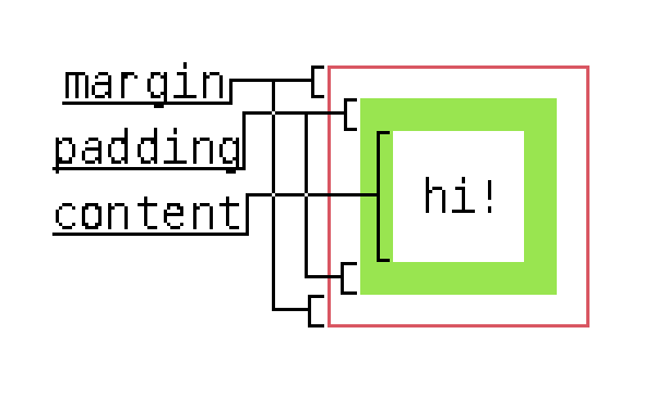
in addition to the widget itself, boxes typically consist of three other parts, but you can omit any of them if needed:
…having an image will probably make it clearer:

is it hypocritical of me to talk about UI when I drew this in less than 5 minutes while caring as little as possible about the placement of anything in it?
my site’s design doesn’t help me either, but honestly, I don’t really care. I’m a game programmer, not an UI designer.
until I have some free time to use a proper UI editor, or even better, to program an example, all other images will also follow this pattern.
because of this, the total size of a box, for both the x and y extents, can be calculated as such:
int boxW = (xPadding + xBorder + xMargin)*2 + contentW;
the x-coordinate can then be increased by this amount to get the x-coordinate of the next box’s top-left corner.
for the people who use xy-pairs drawing functions, sorry
if you want to simulate simple and stupid spacing for your widgets without this complicated system, it’s enough to just add the amount you want to pad by to the x-coordinate, and subtract twice as much from the width. if you subtracted the padding from the width only once, the rectangle’s right border would be juuuuust touching the right border of the enclosing container.
boxes can also be placed relative to their parent, such as next to the left border, at the middle, or just before the right border of the parent.
left border: this case kind of solves itself. if your environment uses x and y positions to refer to one of the shape’s corners, you already have this working; just drawing the box in-place will suffice.

right border: to calculate this, subtract the size of the box from the size of the parent. this amount is how many pixels to offset the box.

int rightX = boxX + (parentW - boxW);
total center: this case is slightly more complicated but not by much. it’s similar to the right border case, but you subtract half of the box’s size from half of the parent’s size:

  int centerX = boxX + (parentW / 2 - boxW / 2);
  // or, alternatively,
  int centerX = boxX + (parentW - boxW) / 2;
for the case where you have multiple boxes you want to fit within a container, the easiest solution I can think of is to sum up the widths of all the boxes and divide that by the width of the parent container. then, when drawing, adjust each child’s width by this ratio.
this is essentially adjusting the widths by the mean of all the children’s widths with respect to the parent.
int childrenWidthSum = 0;

for (int i = 0; i < numChildren; i++)
    childrenWidthSum += childrenWidths[i];

float widthRatio = (float)childrenWidthSum / parentWidth;

int currentX = 0;
for (i = 0; i < numChildren; i++)
{
    int scaledWidth = (float)childrenWidths[i] / widthRatio;

    int res = button(currentX, y, scaledWidth, h);
    currentX += scaledWidth;
    // do something with button()'s result
}
I would show an example image for this but it’d be really complicated to show in a way that makes sense, assuming the other images did make sense in the first place.
I do however have a p5.js example.
also, I really like IMGUIs.
this entire section has mostly talked about the placement of widgets in the X axis, but the nice thing about this is that all the math is exactly the same for both axes. so, yeah, you can go “Find and Replace” your way through these snippets and switch all xs to ys, or even better (or worse), all xs to zs! :)
date format: dd/mm/yyyy